Introduction
Become familiar with the Red-Yellow-Blue (RYB) and Red-Green-Blue (RGB) color wheels and the various color harmonies by analyzing famous logos, paintings and photographs.
This blog post uses an app that was introduced in the previous post “Explore the Color Wheel and Color Harmonies of your Image”. Don’t just guess at which hues dominate in the image - use this app to show you.
The big question behind this effort is: Do pictures following color harmonies have pleasing color combinations? If a picture doesn’t follow any of the color harmony schemes, does it have bad colors? Are pleasing color combinations a subjective judgement? In any case, the concept of color harmonies gives some vocabulary for talking about color.
Please note that I have cherry-picked examples that pretty clearly show various color harmonies. In practice, frequently one color will dominate and the other colors in the color harmony scheme are accents. This is clear to see in logos, but can be difficult in paintings and photographs. Also, don’t be too concerned about the elements of the color harmonies perfectly lining up with the color wheel’s spokes. No one is that precise in applying the color harmonies.
The Color Harmonies and the Color Wheels
Please see the previous presentation https://tanya-riseman.squarespace.com/blog/2023/8/16/explore-the-color-wheel-and-color-harmonies-of-your-image for
An introduction to using the web app https://swsrn.github.io/image-color-wheel/
The color harmonies from color theory
More on the RYB and RGB color wheels
The connection of color wheels to the rainbow and the human light receptors in the eye.
Most images that suggest color harmonies do so with the traditional RYB color wheel. So look first to the right hand side color wheel when trying to identify which color harmony is present.


An Easy Introduction: Logos


Probably purposeful, the color scheme is complementary in both color wheels, making it particularly compelling.


Pepsi logo: It’s OK to leave off one leg of the triad harmony, showing up in the traditional RYB color wheel.


The Google logo is really square in the traditional RYB color wheel and uses classic colors.


Ball Park Logo: It’s OK to leave off one or two legs of the square harmony. Notice how the black, dark red and the medium red all have basically the same red hue, as seen in the middle image showing the RYB color zones.


The NBC logo does not follow any of the color harmonies that I know of, but it is very symmetric in the RGB color wheel, The yellow has been shifted slightly to a light orange, probably because yellow is such a pale color. This color scheme looks great.


The old Apple logo’s color scheme is pretty random in both the RGB and RYB color wheels. It’s not harmonious at all. I think it is ugly.
Color Harmonies of Renaissance Paintings


Now that we are looking at paintings, we need to figure out how to deal with very dark, very light, and desaturated areas, where we aren’t sensitive to the hues. The sliders in the app optionally exclude those areas from the calculation. The excluded areas are shown as black, white and gray, respectively.


Everyone has an orange hue, across all races. Skin tones look pretty neutral to me, but moving the desaturation slider doesn’t exclude skin easily.


This image has a very square color harmony scheme in the traditional RYB color wheel. Something is strange about the foliage. It appears to be a dingy green but is in fact a desaturated yellow. In other pictures, foliage can even have an orange hue. We “know” it’s foliage, so it must be green. Our brains are doing a white balance correction! So, we can not always trust our guesstimate as to the color. So this app offers a sort of unbiased presentation of hues.
Color Harmonies of Mostly Impressionist Paintings
With the dramatic advances of chemistry in the late 1800’s, new, vibrant paint pigments became available. Possibly more adventuresome colors combinations are possible - beyond the traditional red, orange, yellow, green, blue and violet.


The colors are getting pretty vivid. Note the accent color of the baby’s pink clothing, which produces a very small red wedge in the color wheels. I do find the electric greens a little unsettling, but am not sure if keeps me from liking the image.


This mostly dark painting has a three-legged square color harmony in the traditional RYB color system.


This painting’s three-legged square RYB color harmony of blue, yellow and reddish-orange doesn’t seem out of place, but I find it really disturbing. Van Gogh’s face “shouldn’t” be greenish-yellow, because all people are orange! My brain can’t white balance this and is prejudiced against it. There is nothing wrong with green in general, just not for people’s faces. I don’t think that this is an example of a picture avoiding fitting some color harmony thereby making a "bad color combination.
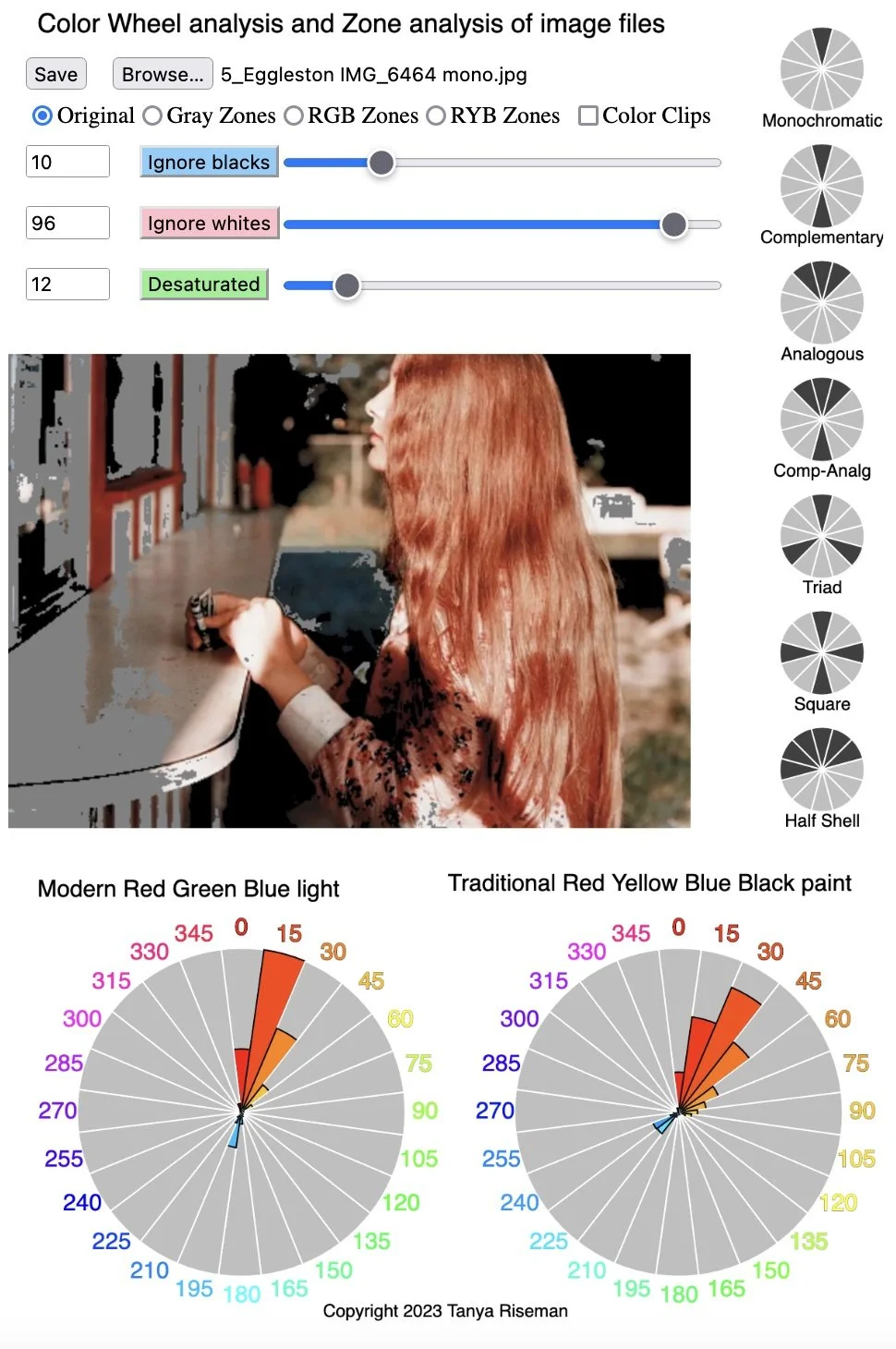
Color Harmonies of Modern Photographs
In the early twentieth century, people discovered that Red-Green-Blue light was an effective, better way of producing images, as its complementary colors mixed evenly produce a pure grey. In comparison, mixing complementary paint colors in the Red-Yellow-Blue color wheel produces a frustrating brown. The success of the RGB system was popularized with color television in the mid twentieth century.
Of those photographers who put an emphasis on the use of color, classically trained ones tended to use the red, yellow and blue primary colors and the secondary colors orange, green and purple. Others photographers were influenced by the new RGB system and worked with alternative colors combinations like the teal-orange complementary color combination in the RGB system. Of course, serendipity often dictates what colors you have to work with. Look at these images and consider which color wheel the photographer might have had in mind.


RYB square


RGB complementary. Really compelling colors!


RYB Complementary - Analogous.
If you treat the skin tones as neutral (brain’s opinion again), then it is analogous in both systems.


Both RGB and RYB half shell harmony.


Both RGB and RYB monochrome, of course.


RGB complementary. Really pops.


Both RGB and RYB complementary color harmonies. Really pops.
In Conclusion/Confusion
The majority of artists have in the past and currently use the Red-Yellow-Blue system with traditional primary colors (red, yellow, and blue) and the secondary colors (orange, green, and purple.) Culturally, these colors are important. Recently color projection (and modern printing) was developed using the improved Red-Green-Blue light system (with secondary colors yellow, cyan, magenta, and black for printing).
As color theory informs us, complementary colors really pop. They pop more so in the RGB system, because the opposite colors are better matched and produce a pure gray when mixed. Particular combinations that are co-incidentally complementary in both systems are particularly striking — yellow-purple as in the Human Rights logo and orange-teal as in some modern photos and cinematography.
Let’s revisit our initial big-picture questions:
Do pictures following color harmonies have pleasing color combinations?
Usually
Do pictures following color harmonies sometimes have unpleasant color combinations?
The van Gogh self portrait is unpleasant, but maybe for other reasons like our brain recognizing the face as being the wrong color.
I’m not sure about the Mary Cassatt painting of the boat ride.
I did not go out of my way to find ugly pictures to test.
If a picture doesn’t follow any of the color harmony schemes, does it have bad colors?
Sometimes yes: The Apple logo for instance is ugly.
Sometimes no: The NBC logo is quite balanced.
Are pleasing color combinations a subjective judgement?
I am confused. I am a novice at this.
Another question: Has RGB made the RYB color system obsolete?
No - there are a lot of artists still thinking in terms of RYB. The two of the RGB secondary colors, cyan and magenta, are less familiar culturally. Cyan is a bit like teal and is used provocatively. Magenta is not a frequent color in nature.
In any case, the concept of color harmonies gives some vocabulary for talking about color.
Unfortunately, I think a lot of color photographers are indifferent to the choice of color and color combinations, which is why I excluded their images. Color is a relatively neglected topic in popular photography, club photography, and college curriculum. In particular, black and white photography may have overly influenced the field as a whole. Which is why I think more photographers should consciously consider the use of color when composing and editing their photographs. As photographers, we may learn more about color from the areas of painting, design, and cinematography.